Last update before the weekend
Since so many countries are either not reporting or reporting fewer or incomplete data on weekends, I decided to no longer report them here. My next update will be on Tuesday.
Brazil: Before the weekend, the data showed us their best: daily infections fell to 24.1 per 100K and daily deaths to 0.504 per 100K. Both trendlines are pointing up though, but not too steeply. The map shows that the city of São Paulo is the hardest hit followed by Veracruz in the region Bahia. Strangely absent is the São Paulo. The daily cases are still avoiding the peak from three weeks ago, which is a positive sign.
Outlook: Very Bad With Maybe Some Hope
U.S. minus CA,NY,WA: Numbers went up just a little, daily infections to 17.2 per 100K and still trending down, daily deaths to 0.376 with a slightly pushed-up trendline. The daily positive tests decreased to 8.3% and the R-value was 1. The risk map shows South Carolina going orange again a day after having gone red. As usual, the international media content themselves with mentioning another day of high daily case numbers (55 000), rather than the downward slope. If the numbers get better at this pace, they will end up at a still high 6 per 100K for the elections. If they happen because dictator Trump does not like elections at a time when the country is in disarray.
Outlook: Very Bad With Hope
California: Here too, numbers went up only a little, daily infections to 20.1 per 100K and trending up, daily deaths to 0.476 and trending up. The daily positive rate fell for the second day to 6.5% and R-value went above 1 for the first time. The risk map from two days ago shows agricultural red and two counties going better (and, most importantly, none worse). It is unclear where the state is going and maybe we will know more after the weekend.
Outlook: Very Bad With Confusion
Washington: Who is the copycat? In this state too, numbers went up only by a little, daily infections to 8.4 per 100K with an unchanged downward trend and daily deaths to 0.158 per 100K and trending up more steeply. The R-value climbed to 1.10 and the risk map has good news for two counties including Okanogan (pop. 42K), that was so bad, even the Governor came to visit.
Outlook: Bad With Hope
New York: Definitely not a copycat but then again, NY is in a league of its own. Daily infections fell a little to 3.7 per 100K and trending flat, while daily death numbers dropped a lot to 0.021 per 100K. The daily positive fell to 0.8% and the R-value remained at 0.93. The risk map has a lot of the colour of hope, just not in Big Apple, where it counts most.
Outlook: Satisfactory With Concern
United Kingdom: Britain's daily case numbers increased like everywhere else in Europe but with 2.1 per 100K, they were half of France's. These values were about 25% of the first peak and growing. HM government instituted a quarantine for Britons returning from their French holiday but why did they let these people leave in the first place? Because the UK numbers looked pretty bad weeks ago already. Daily deaths fell to 0.016 but they are on average 5x as high as the French fatalities. Daily positive rate and R-value were unchanged.
Outlook: Satisfactory Going Worse
France leaves us, before the weekend slumber, with an increased 4.2 per 100K, which is 51% of the first peak of 8.2 and growing. Daily deaths remained roughly at 0.027. The daily positive rate had been increasing for three days, now to 2.4% and the R-value remained at 1.33. The risk map shows 5 Départements going worse and none going better, 23 Départements with elevated risk and 241 clusters (+8).
Outlook: Satisfactory Going Worse
Germany goes into the weekend with unchanged daily cases in three days and just a few deaths. This is good. Daily cases remained roughly at 1.7 per 100K, trending up steeper for the third day though. This value remains thus at 22% of the first peak and it is not growing. Daily deaths fell to 0.007. Now to the not-so-good: The R-value increased to 1.14 and the risk map shows 8 counties (+1) with orange and red. Of the counties changing their risk, 15 went better and 42 went worse, which exemplifies the shift from a focal to an overall increase.
Outlook: Satisfactory Going Worse
Tunisia's new case numbers dropped a little but remained in the vicinity of the first peak at 0.48 per 100K. Of the new cases, 12% were imported. I included a map showing the Medenine region with the hotspot city of Gabès with 114 active cases. The city of El Hamma was particularly hit, where I fondly remember my visit to the hammam (bath house). Daily deaths are 0.000 per 100K, which is no new fatality, demonstrating the lower fatality potential of this second coming. The daily positive rate increased to 3.1%, which is not good. The next days will show if containment of this new outbreak will be successful.
Outlook: Good Going Worse
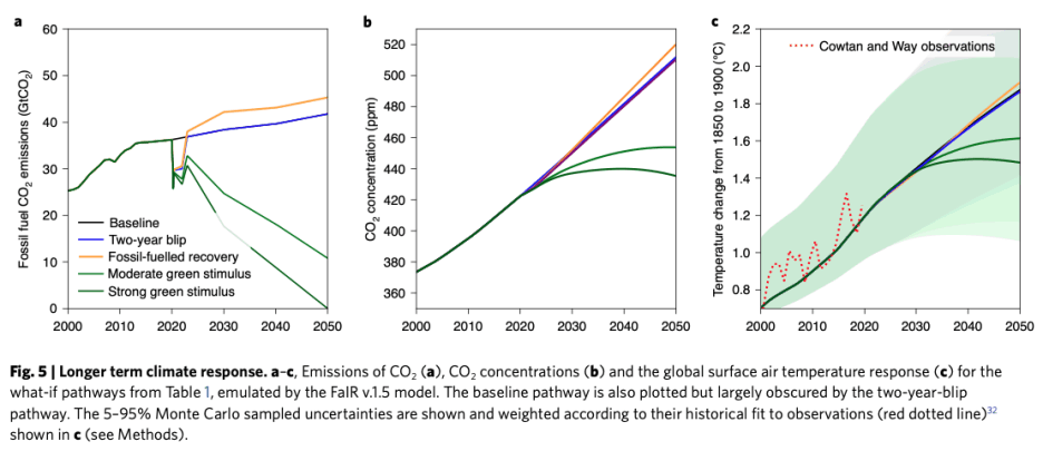
There is a new study out of the University of Leeds which found that the various shutdowns of the economy made only a short dent in the pollution tables. Well, we knew that already.
So the authors then used modelling to predict how emissions could change when the various "green" stimulus packages kick in. The results are encouraging, particularly Figure 5 in the paper (see below).