The weekend drop has not disappeared yet and might make some countires look better than they actually are.
The long trend is pointing towards a rise peaking in early 2021.
Brazil's numbers are still falling, albeit very slowly. Even though daily infections increased from 15.2 to 15.3 per 100K and daily deaths from 0.347 to 0.411, the trendlines are still pointing downward, in particular when extrapolating the last 5 or 6 weeks (instead of the routine 3 weeks).
Outlook: Very Bad Getting Better
U.S. minus CA,NY,WA: In spite of a decrease of daily infections from 18.8 to 12.3 per 100K, numbers are not trending down and it looks as if they were to remain at a high level for some time to come. This is particularly true in the red states and counties (high corona risk and high Republican vote), which do not enforce distancing and mask measures. Daily deaths fell from 0.278 to 0.262, as did the daily positive rate (from 5.8 to 5.2%) and the R-value (from 1.03 to 1.02). A high infection rate should at some point in time be followed by an increased death rate. With the flu season coming, this is most likely to happen during the time when viruses usually hit the northern hemisphere: in the cold months.
Outlook: Very Bad Getting Worse
California seems to have stalled. Because, although daily infections fell from 8.6 to 5.5 per 100K and daily deaths from 0.212 to 0.081, the prior downward trend is broken. While current numbers could lead to a re-start of that good trend, the other alternative, the continuation of relatively high values, is more likely since the winter months will carry their risk to this relatively warm state as well. This said, the risk map looked really good with lots of counties changing for the better. I am curious to see where this is going.
Outlook: Bad With Concern
Washington's numbers are rising again, predominantly in the rural counties. For the state as a whole daily infections dropped from 7 to 4.8 per 100K while the reporting of daily deaths is seriously hampered (currently reporting zero for three days in a row). On the risk map, 6 counties went for the worse and only two for the better.
Outlook: Bad Getting Worse
France: While the number of infections are coming down (or going flat at least), deaths are on a dangerous rise. Daily infections fell from an outrageously high 23.6 to a still unhealthy 12 per 100K. While daily deaths decreased from 0.224 to 0.127, the trend is still pointing up steeply. The daily positive rate increased to 7.6%, which demonstrates that not enough testing is being done (their testing rate is also behind Germany's). The risk map showed, for the first time in a month, one Département going better. And two went worse, keeping only 10% of the Départements at the lowest risk level. And these are mostly rural. Which is remarkable because in the U.S. it is the contrary.
Outlook: Very Bad Getting Worse
United Kingdom: Daily infections increased from 10.1 to 10.5 per 100K, which is a record high. While it is true that, since the end of lockdown in May, testing shifted from the sick to the general population, thus picking up more people with no or mild symptoms, it is the number of hospitalisations (in particular in the ICU) and deaths that is really telling whether things are getting worse. Daily deaths have been on a steady increase since mid September and they have reached a 3-month high, going from 0.043 to 0.105, with a steep upward trend for three weeks. The R-value remained at 1.35. I learnt that this value is difficult to compute and it might therefore not always be correct. The daily positive test ratio is easy to calculate and it rose to 3.5%, which is indicative of a diminishing testing capacity.
Outlook: Bad Getting Worse
Tunisia has finally caught up with number reporting but it resulted in two record highs: Daily infections increased from 9.3 to 11 per 100K and daily deaths from 0.094 to 0.273, a dangerously high number. The daily positive rate rose from 21% to 29%.
Outlook: Bad Getting Worse
New York: Daily infections increased from 4.7 to 6.1 per 100K, continuing the week-long upward trend. Daily death numbers, however, dropped from 0.021 to 0.010. The risk map saw more counties going for the worse than for the better. The current rise in daily infections is caused, amongst others, by a rise in New York City boroughs where a high percentage of Orthodox Jews were celebrating Yom Kippur without wearing masks and without distancing. While these Jews are protected by their god, the poor goyim they pass the virus to will not. I am curious to see if this has a longer-lasting effect on NCY's numbers. But probably not, since it is such a big city.
Outlook: Satisfactory With Concern
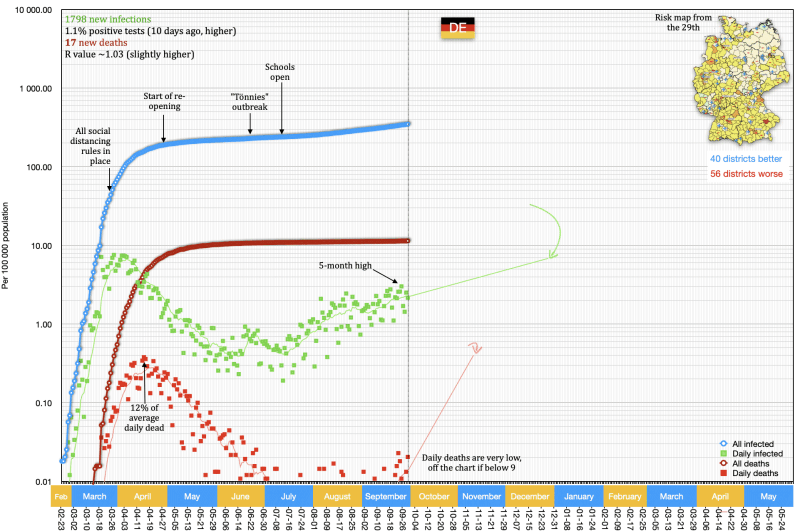
Germany: Daily infections decreased from 3 to 2.2 per 100K while daily death numbers increased from 0.011 to 0.020, both being low. The R-value remained above 1 and the risk map had more districts going for the worse than for the better. It also included more red and orange colours than ever before, in particular in the big cities. Both trendlines are still pointing up and German officials are bracing for worse things to come.
Outlook: Satisfactory With Concern
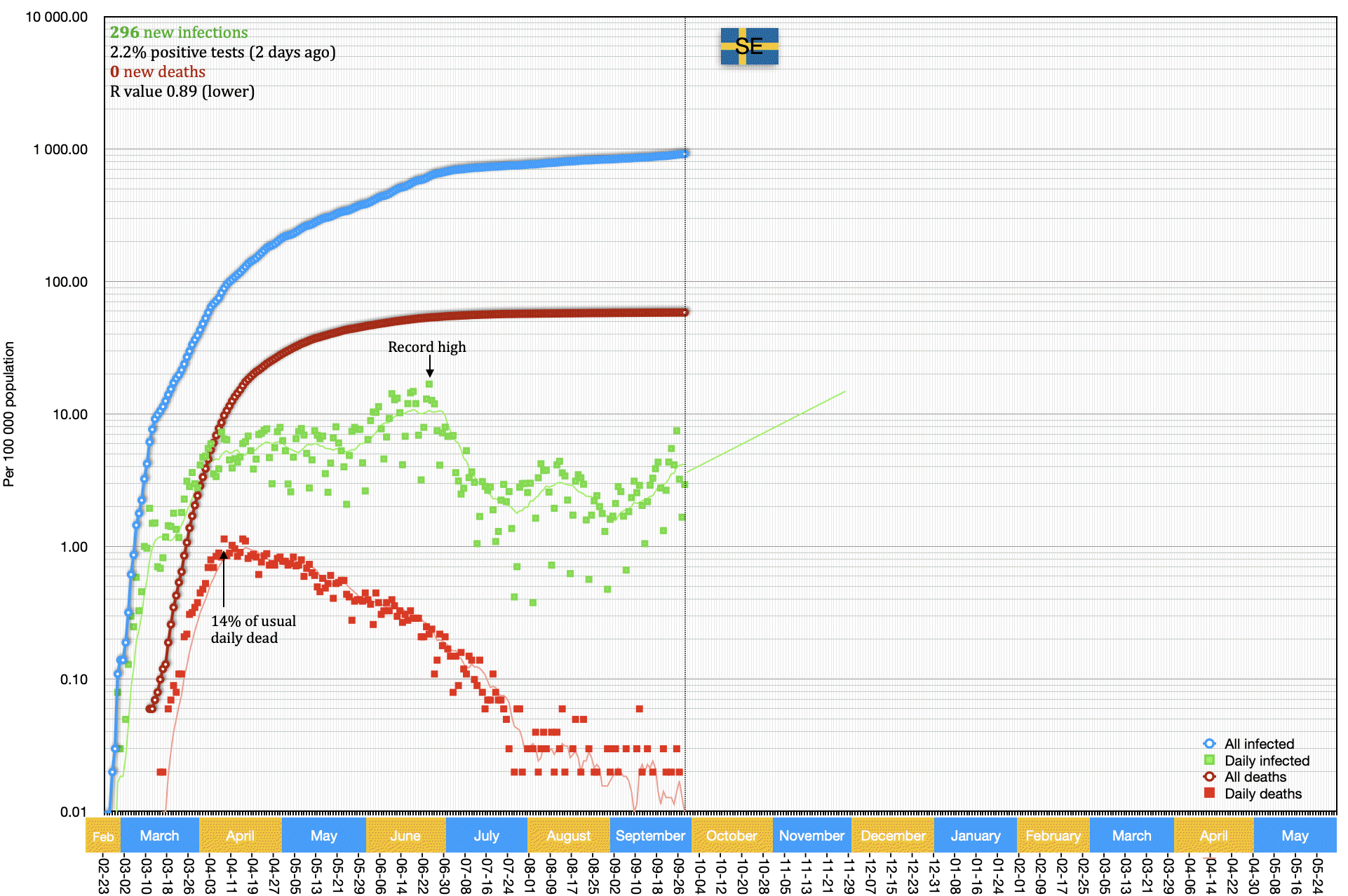
The Swedish model has been in the news before and lately again, it was either praised as an example of how numbers could be curbed without too much damage to society and economy, or it was used as an example of how things have gone wrong. So I made a graph to see for myself.
The competition is the best performer on my list: Germany.
The first thing you see is that at its peak, Sweden had 3x more deaths per capita than Germany. Cumulative deaths are even 5x higher in Sweden. Also, as in most other European countries, the death rate is predicted to rise again in December.
The second thing you notice is that Germany had its highest number of daily deaths in late March, with 7.6 per 100K. Sweden's no-lockdown policy pushed that high value out by one month and in late April, they recorded 7.7 per 100K, a tad higher than Germany's peak. So far, Sweden had 2.6 times as many cumulative infections than Germany.
The third thing you notice is that Sweden had an absolute peak of new infections in late June when all other European countries had seen a decline of their case numbers. This peak is 2.2x higher than the highest daily number recorded in Germany.
And now? Sweden has daily infections of 2.9 per 100K (Germany: 2.3).
My conclusion: Germany beat Sweden 5:1 in deaths. Enough said.