The Americas blessed by a miracle, some of Europe marching to a second peak, Germany and New York going flat.
When countries are ruled by people for whom numbers can decide elections, and if these numbers change much faster than predicted, caution is the name of the game.
Brazil's numbers decreased by a lot over the weekend. The case map however showed 12 states with more cases and only one with fewer. That is contradictory and will hopefully resolved in Saturday's update. Daily infection numbers fell from a very bad 24.4 to a bad 6.8 per 100K. Likewise, daily deaths fell from 0.432 to 0.240.
Outlook: (Very) Bad With Hope
U.S. minus CA,NY,WA: And a miracle happened! Daily infections dropped sharply over the weekend, from 16.8 to 6.8 per 100K and so did daily deaths, which dove from 0.305 to 0.081. The R-value remained above 1 though but daily positive tests also fell from 6.7% to 6.3%. The risk map had too much orange and red though, but only two states went for the worse and Vermont for the better. With all the attempts of manipulating the data as the election is nearing, it is wise to wait and see how the numbers have developed in this Saturday's update.
Outlook: (Very) Bad With Hope
California, too, saw a big drop in numbers, which gives some credibility to the drop of the US numbers. Daily infections fell from 13 to 7.2 per 100K (a three-month low) and daily deaths dropped from 0.413 to 0.120, which is at the lower end of the very wide corridor the numbers have set in past months. The R-value was 0.82, the lowest in the U.S. and the risk map had so many pluses on it (counties going for the better) that you can hardly make out the colour underneath them.
Outlook: (Very) Bad With Hope
Washington reported no values for the 8th, so here are the numbers from the 7th. Unlike California and the US (minus NY, WA and CA), Washington continued its stable but slow downward trend, with daily infections dropping from 6.3 to 5.2 per 100K. There have been no deaths reported in three days, which technically makes the daily deaths a 0.000. It remains to be seen if this is a believable number. The R-value went above 1 again, now at 1.02, which is OK. The daily positive rate remained at the very low 2.9 from before the weekend. The risk map had little change. Once data reporting has been solved, we shall see clearer, hopefully on Saturday.
Outlook: Bad With Hope
France: After the all-time high, daily infections kept falling over the weekend from 13.4 to 9.8 per 100K. Worrisome: the daily deaths, which had remained relatively low while infections were going up, rose from 0.028 to an 8-week high of 0.057. The daily positive rate had been increasing for six weeks to the current 5.2% (going over the 5% threshold), indicating that the turning point may not have been reached. The R-value remained at the high of 1.29 from before the weekend. The risk map had been changed to a 3-colour map by France Santé and 16 Départements went for the worse while none went for the better.
Outlook: Bad Going Worse
New York: Daily infections fell from 4.4 to 2.9 per 100K, which pushed the trendline closer to the horizontal, where it has been for weeks and seems to feel comfortable. The numbers will probably remain around this line until a vaccine can be administered. Daily death numbers rose from 0.026 to 0.031, closer to the upper end of a high-fluctuation 5-week corridor. The risk map shows one county with no big city in red. I assume that it must be an outbreak at some meat processing company or similar. Otherwise, risk has not changed much.
Outlook: Satisfactory With Concern
United Kingdom: It is getting bad. Daily infections rose from 2.9 to 3.6 per 100K. Daily deaths tripled from 0.015 to 0.047, which could be an outlier given the much lower values from the last 5 weeks. But maybe it is not. R-value and daily positive tests continued to look good. The government has decreed tougher rules and Britons now fear that Christmas will be cancelled.
Outlook: Satisfactory With Concern
Germany: The number of people who infected themselves outside of Germany (the holidaymakers and returning menial workers) decreased from 50% three weeks ago to 30% in the last calendar week, which is probably the reason for the overall slump in new infections during the same time period, which further fell from 1.6 to 1.4 per 100K over the weekend. While this all looks good and new infections are even trending downward, the number of districts with worsened risk has risen above those with better risk, which shows that daily infections will probably remain at a high level for at least a week. The daily death numbers increased from a low 0.002 to 0.011, which is still low enough to not to worry about. The R-value increased to barely below 1 at 0.98, which serves as another warning that Germany is not yet out of the woods. The most affected districts are still in the south, notably in Bavaria, which has a few orange and even red ones. This state should accordingly have tighter measures than the rest of Germany, which it doesn't.
Outlook: Satisfactory With Concern
Tunisia has seen the largest daily infection number on record, doubling from 1.3 to 2.5 per 100K. Daily deaths however fell from 0.026 to 0.017, which are both relatively high values but represent only three or two fatalities. The daily positive rate jumped from 6.6% to 9.1%, which reflects the fact that not enough testing is being performed.
Outlook: Satisfactory Going Worse
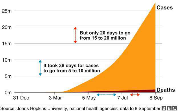
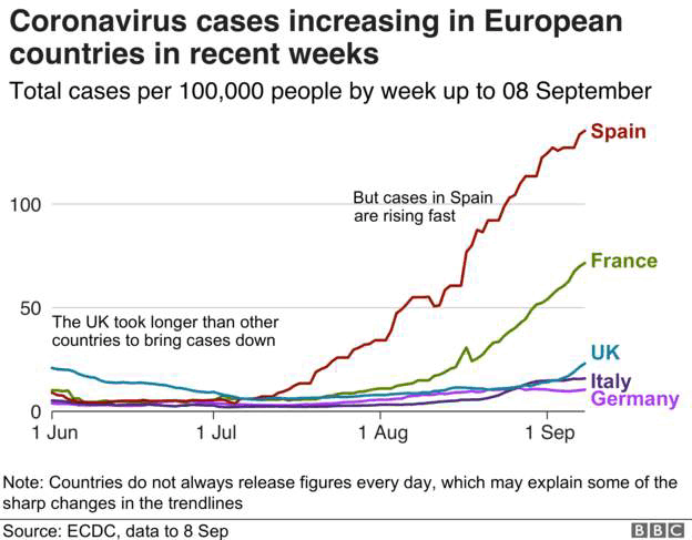
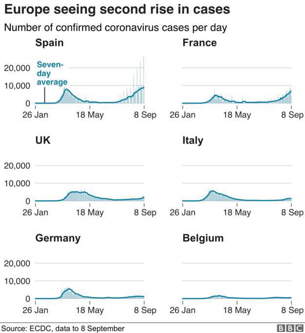
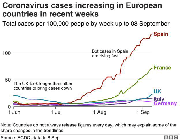
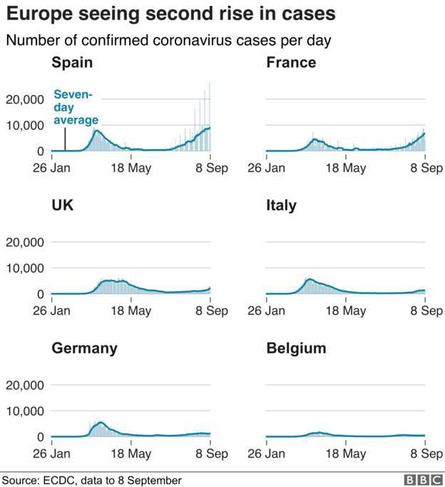
The BBC has featured these three graphs on their Corona Blog page, which I cannot find any more, because otherwise I would link to it.
The first one is another way of demonstrating the exponential growth of world SARS-CoV-2 (that's the name of the virus in case we forgot) infections. What it also shows (but does not say) is that it took the same 20 days to go from 20 to 25 million, indicating a slowdown of the rate new cases are added every day.
The other two graphs are self-explanatory. The middle one shows Spain and France as the European nations to worry about. Since all countries have roughly similar populations, the graph is actually OK even though data are not reported by population. You can also see the start of a re-surge in UK cases.
The last one should only be compared within a country because Belgium has only 13% of the population of Germany. What you then see is that both France and Spain have surpassed their first peaks, whereas Italy, Germany and Belgium have only mild bumps for their second peaks. Another lesson is that Belgium looks pretty tame in this picture because numbers are not reported by 100K population. In reality though, Belgium, in particular the Brussels region, has such high numbers that the EU parliament is severely impacted.